Redesigning the Ahammune website
for clarity in information architecture and better user retention
Client
Ahammune Biosciences
Duration
12 weeks
Team
Sagarika Konanuru
Role
Information Architecture, UX Design, and UI Design


The Opportunity
Ahammune Biosciences Pvt. Ltd. is an innovation-led drug discovery startup based in Pune, India that focuses on developing new treatment options for immune mediated diseases of the skin. Their current program is on the depigmenting disorder, Vitiligo. The organization approached us to help rejuvenate their current website to help increase user engagement and connectivity.
The Design Process
01
Research
-
Website Analytics
-
User Persona
02
Strategy
-
Identify problems
-
Revise Information Architecture
03
Design
-
Task/User Flows
-
Style Guide
-
UI Design
04
Validate
-
Mid-fidelity Prototype
-
User Testing
-
High Fidelity Prototype
Research
Target Audience
From my discussion with the Founders and Board members, I identified the main features that I would need to create an MVP, and the target audience to consider while designing the website.
Our target audience included :
-
potential investors - since the company is a startup and is looking for investment
-
licensing companies - since the company would like to license their product to be sold
-
scientists/enthusiasts - who would like to join the company or understand the product development process


From my preliminary analysis of the website and discussions with the founders, I could identify the following main problems which were critical to address during our design process to enhance the user experience of the website.
Strategy
Problems
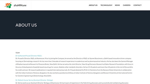
Lack of visuals/ Text heavy
Most of the pages relied solely on textual information, and hence were not visually appealing or attention-grabbing.
The fonts and the text also made the website readability extremely low, and not accessible to many.


Complicated website navigation
The users had issues navigating to their goal of visiting the website, since the information architecture was not well structured and several sub-menus redirected to similar looking pages.
Lack of concise information
The information provided on the website was very detailed, and not concisely bifurcated into sub topics. This leads to lack of user engagement and retention.
Strategy
User Personas and Stories
Through understanding our users, I identified the following personas whose user experience is more likely to improve after the redesign of the website.
I then identified two of the most important task flows that we believed would be crucial to our development of the website interface. We then created our user story to reflect the journey a user would take in completing the said task, and divided into sections for easier development.
User Story #1 - Potential Investor
"As an investor,
I want to learn more about the company's milestones and team members
so that I can evaluate whether I would like to propose a deal to invest in the company."
User Story #2 - Scientist
“As a scientist,
I want to read about the company's current product development timelines, and the science behind them
so that I can understand the value and vision of the company”


Strategy
Information Architecture
Using our data from our preliminary analysis and user stories, we formulated a new version of the information architecture. This condensed the scattered information from across the current website into 4 distinctive main menus that would clearly yet concisely indicate all the information required by users.

Current Site Map

Final revised Site Map
Design
Low-Fidelity Prototype
Based on our understanding of the target audience, user stories, I created a low fidelity prototype to showcase the revised user experience and information architecture.
Low Fidelity Interactive Figma Prototype
Design
Style Guide
I decided to stick to the primary colors of the current logo to retain the brand identity - green and orange, while making it more vibrant and new with distinct photos and banner styles.


Design
Design
High Fidelity Prototype
With the final input from the user testing with the low fidelity prototype, I finally started developing the high fidelity prototypes for the tasks that we found to be most critical during our initial user stories - primarily the company profile, and the technology page.
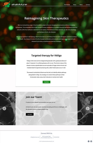
Home Page
The home page consists of three main parts -
-
the main hero image of the cells on the landing frame with the revised navigation bar and short blurb about the company's vision to introduce the company
-
brief about the ongoing project to help establish the current situation of the company
-
quick links in the form of a carousel to the most frequented pages - contact us page and the news page for ease of access


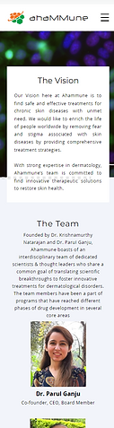
Company Profile Page
The main features of the Company Profile were:
-
short blurb about the company's vision and mission to help establish a basis for the company profile
-
individual team member icons with pop ups containing more information to allow the users to learn more about the team, as well as identify different members visually
-
recommendations from other investors and companies to create more trust in the company
Ongoing Projects Page
The main features of the Ongoing Projects page was:
-
short blurb about the ongoing project to help give background for the product
-
product timeline to help the users understand what phase of product development the project was in
-
details about the market requirement for the product and scientific facts about how the product works for better understanding


Interactive Figma desktop prototype
Feedback
Main Takeaways
The clients loved the website prototype and appreciated the clarity and structure of the information in the revised website. They also mentioned a couple of elements they enjoyed including the visual appeal of the page backgrounds, and the addition of the pop-ups to the team member's profiles.
I truly believe that the redesign of the website allows for better user engagement and navigation - both which we found were some of the main issues in the website prior to redesign.
It was incredibly rewarding to take on this project and help a startup showcase it's talents through a better designed website.