Redesigning the NYC UFAA website
for clearer navigation and better engagement
Client
NYC Urban Fellows
Alumni Association
Duration
12 weeks
Team
Sagarika Konanuru,
+ 2 UXR students
Role
UX Research, Information Architecture, UX Design, and UI Design


The Opportunity
The NYC Urban Fellows Alumni Association is a not-for-profit organization of former participants of the NYC Urban Fellows Program. The association is intended to help sustain an active network of alumni who support each other socially and professionally.
The organization approached us to help rejuvenate their current website to help increase user engagement and connectivity.
Since their ask was quite broad, we decided to create a research plan which was exploratory - starting off with a preliminary analysis and user interviews, to understand why there was 'lack of engagement'.
The Design Process
01
Research
-
Competitive Analysis
-
User Interviews
-
Empathy Mapping
02
Strategy
-
Persona
-
User Stories
-
Card Sorting
-
Tree Testing
03
Design
-
Task/User Flows
-
Style & UI Design
-
Mid-Fidelity Prototype
04
Validate
-
User Testing
-
High Fidelity Prototype

Research
User Interviews

We conducted 6 user interviews with alumni members to get a better understanding what was lacking in the current website, and what deterred the users from utilizing the website more often.
With our insights from the interviews, we used empathy mapping to understand what parts of the current website frustrated the users, their thoughts on the current website, and their main intentions of visiting the website.
Then, we began to assess the changes required to the website to target our users's needs.

4/6 of our interviewees indicated the lack of an 'avenue' to communicate with other alumni within the website - they would like to connect with others sharing the same career path.
But they mentioned they were uncomfortable with their private information on an open website.
Issues Found
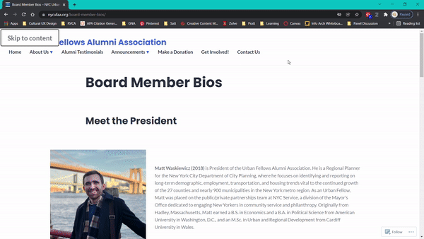
Complicated website navigation
Users have issues navigating to their goal of visiting the website, since there were menu overlaps. Additionally, the pages had too much text, making the readability low.
Solution: Card Sorting and Tree Testing

Difficulty in networking
The absence of an alumni information point on the website led users to find it difficult to connect and engage with other alumni.
Solution: Alumni Directory
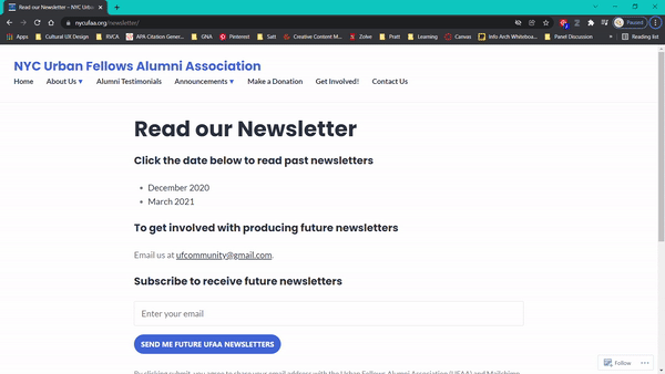
Lack of quick updates
The unavailability of quick, easily digestible, updates on the website demotivated users from frequenting the website more often.
Solution: Home Page with updates
Research
User Persona
Through understanding our users, I identified the below alumni persona whose user experience is more likely to improve after the redesign of the website.

-
Our users are finding it difficult to find information and connect with others due to the inconsistency in the information architecture of the website.
-
They often miss important updates due to the lack of easily accessible and digestible information
-
Therefore, most of our users don’t engage with the website since it is easier to find information in third party websites.
Strategy
User Stories
Using our revised information architecture, we identified two of the most important task flows that we believed would be crucial to our development of the website interface. We then created our user story to reflect the journey a user would take in completing the said task, and divided into sections for easier development.
User Story #1 - Alumni Directory Flow
"As a UFAA Member,
I want to contact other fellow members,
so that I can maintain being socially active within UFAA and further learn about UFAA related and general industry opportunities."

User Story #2 - Events Flow
“As a UFAA Member,
I want to find relevant alumni events I can attend,
so that I am able to stay connected with other alumni and reach my career goals.”

Strategy
Tree Testing
Using our data from the preliminary analysis, user interviews and card sorting, we formulated our first version of the information architecture and tested it with 11 participants who were asked to find various pieces of information in the website through a tree test on Optimal Workshop. We further made 3 iterations of the tree, testing each version until we concluded on our final version of the information architecture.


Current Site Map
Final revised Site Map with insights

The content in each menu was overlapping, leading to a frantic search for information. By making the tree more 'horizontal' and indicating the subheadings' content through clear vocabulary, we achieved a 95% accuracy rate, from the initial 65% during the tree testing.
Design
Mid-Fidelity Prototype & User Testing
The first task flow that we developed into mid-fidelity was the Events Flow - a brand new section that we found to be crucial in increasing user engagement, and interest.

By testing this prototype with several participants, we could determine some of the shortcomings of our UI -
mainly pertaining to the vertical filters, and lack of CTA buttons within the first landing frame.
We further created 2 iterations of this prototype before closing on the final design.
Design
Style Guide
We began to then ideate the style guide we intended to use for the entire website. We decided to stick to the primary colors of the current website to retain the brand identity - blue, while making it more vibrant and new with distinct photos and banner styles.


Design
High Fidelity Prototype
With our final inputs from the user testing done with the low fidelity prototypes, we finally started developing the high fidelity prototypes for two tasks - RSVPing to an event, and connecting with an alumni member - the tasks that we found to be most requested by the alumni members during our initial user interviews .
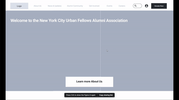
Home Page
The home page consists of four main parts -
-
main banner on the landing frame with the revised navigation bar and donate button for easy access
-
information page for NYC UFAA for the first-time visitors to the page
-
quick links to the most frequented pages - events page and the donate page to encourage more participation and donations
-
carousel leading to the latest updates like events, and news pieces to extend user engagement


Alumni Directory Page
The main features of the Alumni Directory pages were:
-
Alumni profiles as 'cards' with clear indication of the industry they work in and year of graduation to help readability
-
individual user profiles with options to contact them over different platforms like email, phone and LinkedIn to enable easier networking
-
prompts in a carousel to visit more alumni profiles with similar background to encourage better user engagement
Events Page
The main features of the Events pages were:
-
horizontal filter bar that is visible upon the landing frame, making it easier to access
-
listing view of the events cards with clear indication of date of event, as well as tags indicating the price and type of event for better readability
-
floating details bar on the right of the individual events page for easy access to the RSVP CTA button


Figma desktop prototype
Figma mobile prototype
Feedback
Main Takeaways
During the formal final presentation, the clients seemed to very much like the website prototype and appreciated the ease in getting through the task flow throughout the presentation.
They also mentioned a couple of elements they enjoyed including the layout of the alumni directory page, and the clarity of the events page.
To evaluate the redesigned website, I would suggest monitoring the following metrics:
-
No of users that sign up for the alumni directory
-
No of connection/message requests on the website
-
Overall website traffic and engagement vs prior to redesign